Creating a peaceful and relaxing atmosphere in your home often starts with the colors you choose for your walls and decor. Calm colors have the power to soothe the mind, reduce stress, and make your living spaces feel welcoming and restful. Whether you’re redecorating a single room or giving your entire home a refresh, understanding how to pick calming colors can help you craft the perfect sanctuary.
In this post, we’ll explore essential tips for selecting calm colors, explain why color choice matters, and offer practical ideas to bring tranquility to your home.
Why Choose Calm Colors for Your Home?
Colors can influence our moods and emotions. Bright, vibrant shades may energize, but often they aren’t the best choice when you want a quiet, relaxing environment. Calm colors—such as soft blues, greens, and neutrals—are known to promote feelings of peace and comfort. When thoughtfully applied, these colors can make rooms feel more spacious, reduce anxiety, and enhance overall wellbeing.
Tips for Choosing Calm Colors
1. Understand the Psychology of Color
Different colors evoke different feelings:
– Blue: Often associated with tranquility and stability, soft blues can recreate a soothing seaside vibe.
– Green: Connected to nature, gentle greens help foster relaxation and balance.
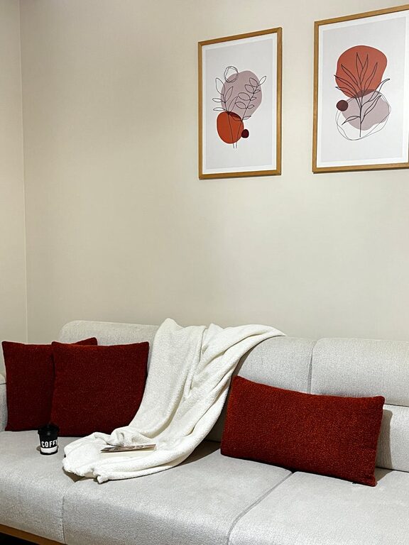
– Beige and Taupe: Warm neutrals provide a cozy, inviting feeling without overwhelming the senses.
– Lavender and Soft Purple: These hues add a touch of calm luxury and can help reduce stress.
Consider what emotions you want to evoke in each room before selecting colors.
2. Use Lighter Shades for Maximum Calm
Light colors reflect more natural light and feel airy, making the space more open and calming. For example, pale blues or muted greens can make a bedroom or living room feel serene without causing visual fatigue.
3. Consider the Room’s Purpose
– Bedrooms: Aim for colors that promote restfulness like soft blues, sage greens, or light grays.
– Living Rooms: Warm neutrals combined with calming accent colors can create a welcoming environment.
– Bathrooms: Light aqua or seafoam green hues evoke a spa-like atmosphere.
– Offices: Subtle shades of green or blue may improve focus while keeping anxiety low.
Choosing colors that align with how you use the space will create harmony.
4. Test Colors in Different Lighting
Natural and artificial light can change how colors appear. Paint swatches on your walls and observe at different times of the day to see how the color shifts. Sometimes a color that looks calm in a store or catalog can feel different under your home’s lighting.
5. Balance Calm Colors with Textures and Accents
Even the most calming color can feel flat without variety. Add interest by pairing calm wall colors with:
– Soft fabrics like linen and cotton
– Wooden furniture or natural materials
– Subtle metallic or glass accents
These elements will add warmth and depth to your space.
6. Use Color Combinations Wisely
Combining shades can enhance a calm atmosphere. Stick to a palette of two or three complementary calm colors rather than mixing too many. For instance, pale blue walls with cream furniture and sage green accents create a cohesive and restful look.
7. Avoid Overly Gray or Dull Tones
While neutrals and grays can be calming, too much gray or an overly dull tone can make your space feel cold or depressing. Aim for warm or soft versions of these colors to maintain comfort.
Popular Calm Color Choices to Consider
Soft Blue
Soft blue is a classic calming color associated with the sky and water, elements that naturally relax us. It pairs well with white trims and natural textures.
Sage Green
Sage green carries the soothing qualities of nature and works great in living spaces and bedrooms, providing an earthy yet refined look.
Warm Beige
Warm beige offers neutrality with coziness. It is an excellent backdrop for varied decor styles, from modern to rustic.
Light Lavender
Light lavender adds calm without feeling dull and creates a subtle touch of elegance and warmth.
Pale Gray
Pale gray is versatile and modern but should be chosen with care to maintain warmth. Pair it with soft white or pastel accents.
Final Thoughts
Choosing calm colors for your home is about understanding how hues influence mood and creating spaces that welcome relaxation and comfort. Taking time to test colors, considering the function of rooms, and thoughtfully combining shades can transform your home into a peaceful retreat. Remember, the best calm color palette is one that aligns with your personal taste and lifestyle, making every room a sanctuary.
Start by experimenting with sample paint colors, and don’t hesitate to add texture and natural elements to complement your chosen palette. With these tips, you’ll be well on your way to creating a home filled with calm and serenity.